
Only works on data arranged in categories with sub‑categories.
Excel’s Sunburst Chart is a visually compelling way to demonstrate data organised in categories with sub-categories. The example below reflects sales figures for an ice cream parlour in Plettenberg Bay (a popular seaside holiday town). Sales data is typically recorded on a monthly basis. Additionally, the sales data is divided into four, financial quarters. Download the data file and follow along!
Required knowledge:
Select the data range A2:C14 (or A1:C14), activate the Insert menu ribbon and select the Sunburst Chart option from the Insert Hierarchy Chart button.
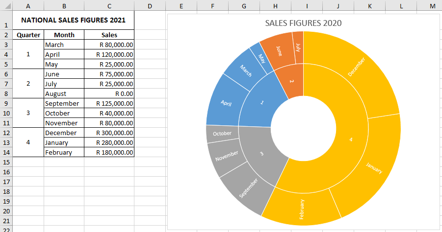
The 4th Quarter comprises the summer months and the end-of-year school holidays, and the chart below makes it abundantly clear that this is when the business does most (more than 50%) of its business.